The Frye Boot Company
Envisioning the Frye story
The new responsive web experience of Frye aims to connect the past with the future—evolving the brand for a fashion-forward audience while telling the story of Frye's rich heritage and history. By creating a timeless and inspiring experience for new and returning customers and incorporating compelling and fresh content around craftsmanship, the redesigned e-commerce experience looked to build a more personal connection with customers.
Project type
Responsive web
Date
2015
Services
Brand strategy
Responsive site
User experience
Background
Frye is a brand proud of its heritage, attention to detail and quality of its products. However, the existing site and content types did not support this relevant and rich experience. There was a unique opportunity to encourage users to returns to the site with compelling and fresh content around craftsmanship and quality and an engaging shopping experience of the unique collections.
I worked in a team at SapientNitro to help redesign Frye’s e-commerce site and digital experience. Our goal was to improve and expand the Frye story to help amplify its differentiation, extend the brand’s reach and recognition, and increase traffic and incremental sales with a fully functional responsive website.
As one of the two experience designers on the project, I was responsible for designing the experience of the Home Page, Content pages, Product Listing page, Product Detail Page, Favorites Page and a few other miscellaneous pages. I concepted and created wireframes and flows to deliver a unique and brand centric user experience.
Frye's existing site came short in delivering a branded and seamless user experience with inconsistent visual styles and outdated user interactions
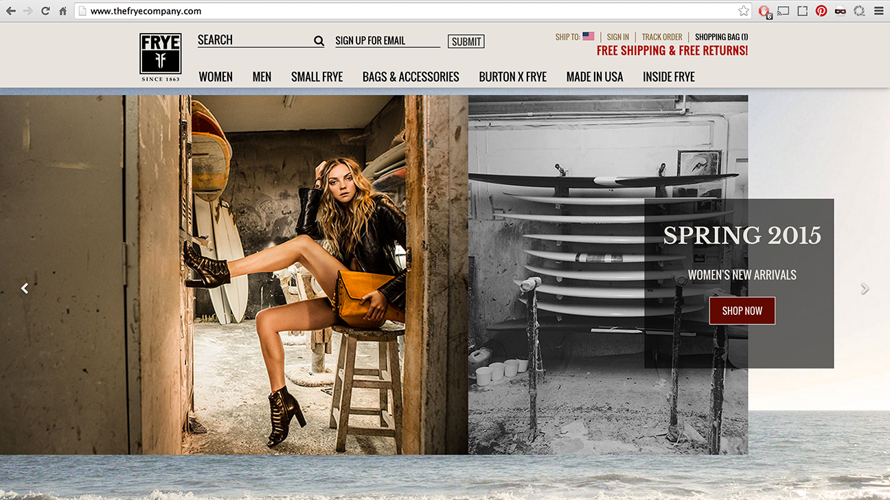
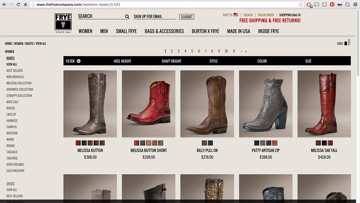
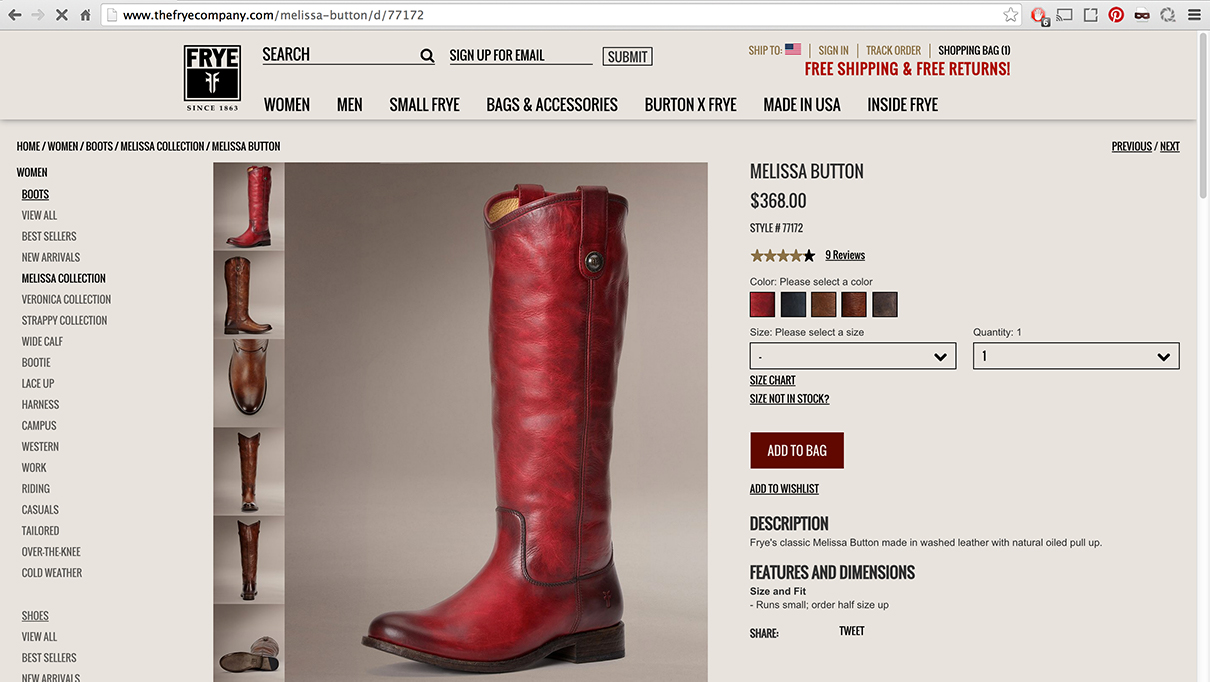
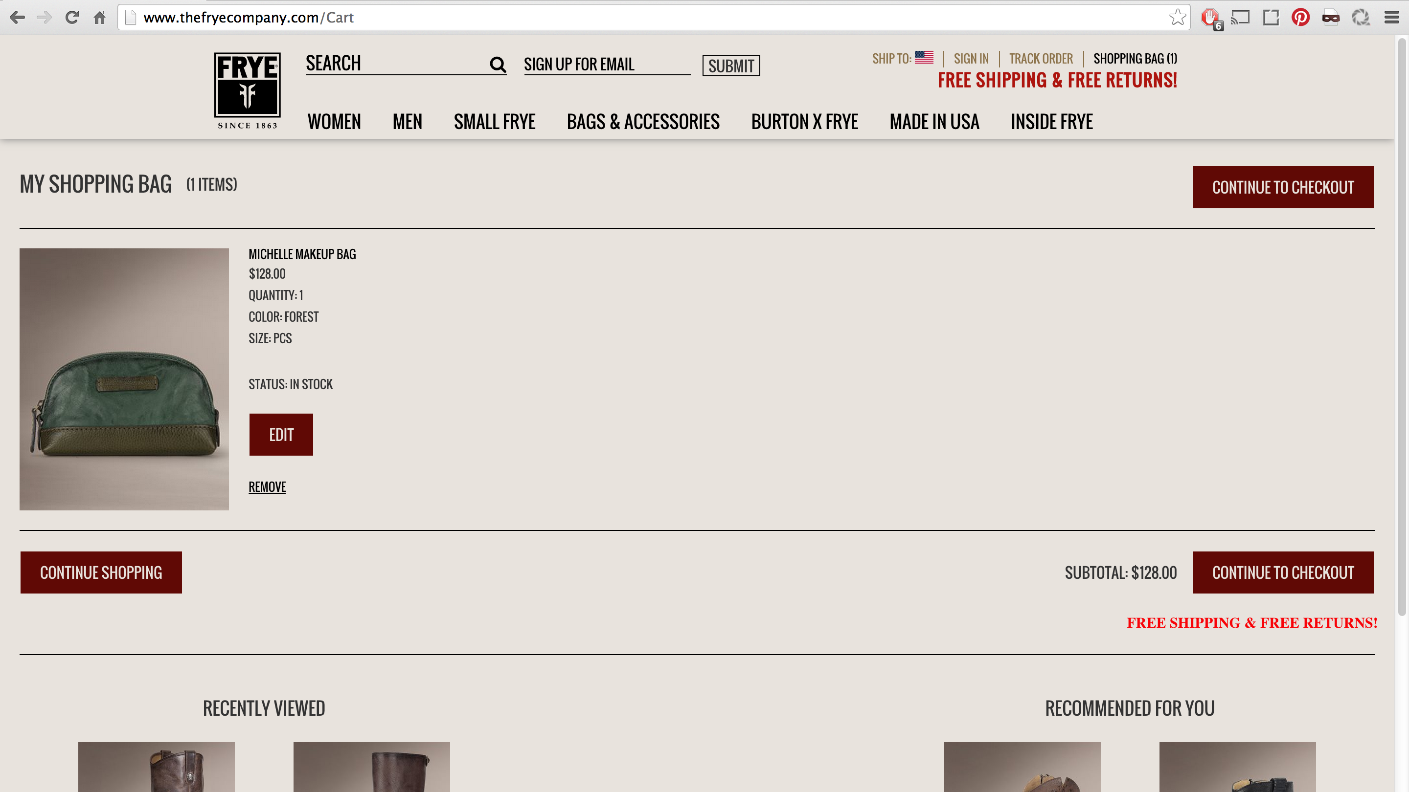
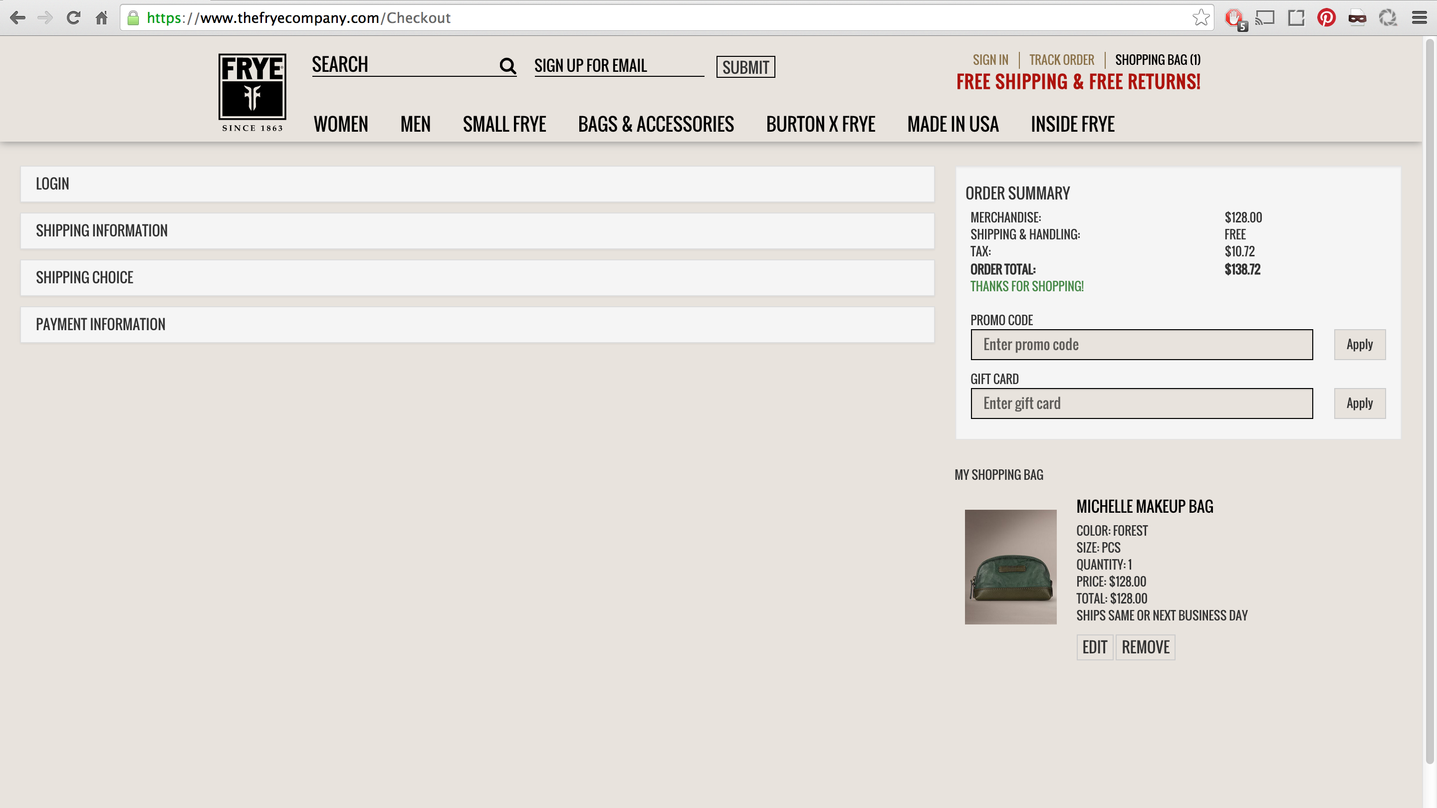
When auditing the old site, we found that many product descriptions were out of date, content was not easily browseable, and the design was not aligned with the Frye brand- leading to low engagement and conversion rates. There was a big opportunity to help the brand leverage the online space to drive more sales and customer loyalty.
How do we utilize the customer, brand and business to help inspire the redesign?
Given Frye's high brand loyalty among its customers, there was an opportunity to rally and galvanize its fans to help drive the brand's story. We could tell this story through a distinct shopping experience, and inspire beyond the boot with the role for digital.
To help the narrative, we wanted the designs to embody the words that the brand has evolved to own: authenticity, heritage, craft, quality, pioneering, bold, confident and forever moving.
Experience principles were conceived to inform the design explorations:
Continuous
Create flow for the conversation to grow across platforms
Involve
Engage our customers and influences in the love of Frye
Inspire
Celebrate fans' style and showcase the looks
Home page
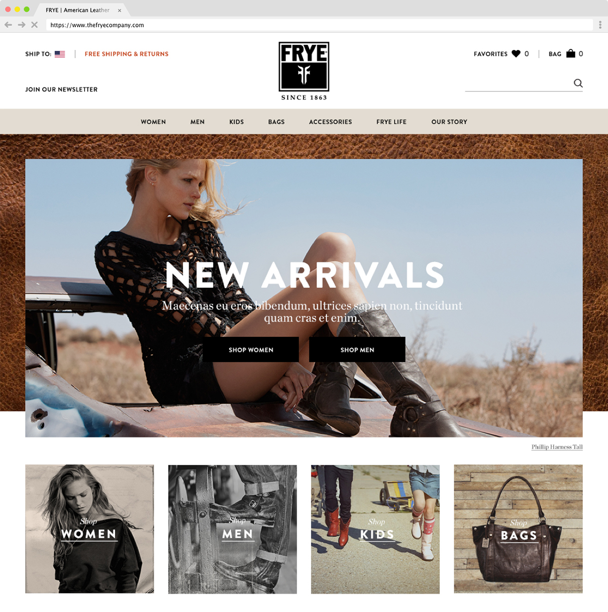
The homepage was designed to answer the following: What is Frye all about? Do they have what I’m looking for? What’s popular? What’s new?
We designed the page for users to dive in directly into products, whether it be by specific gender or age or by finding the right boots with a specific styling feature. Frye’s most prominent collections were featured to highlight what makes each special and unique.
Product Listing Page
Grid View
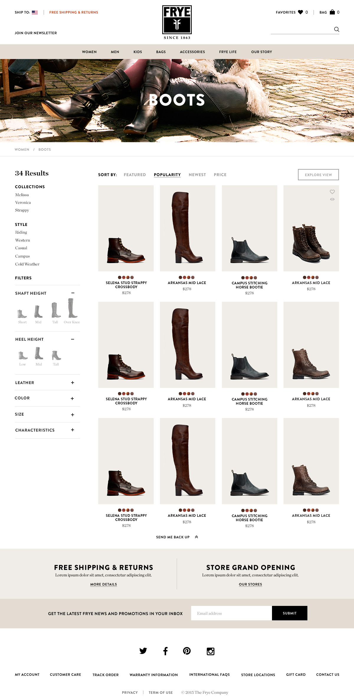
The product listing page was designed to answer the following: What’s relevant to me? Do they have the specific boot I’m looking for? Have I seen all boots for the specifics I’m looking for? What’s my “shortlist” of products?
We were challenged to think about incorporating a “Boot Finder” into the website to help new consumers find their perfect first pair. While we explored the option of a separate boot selector, we wondered if this experience can exist within the product listing page instead. The final concept revolves around a ‘visual filter’ to enable users to easily narrow down their choices.
Explore view
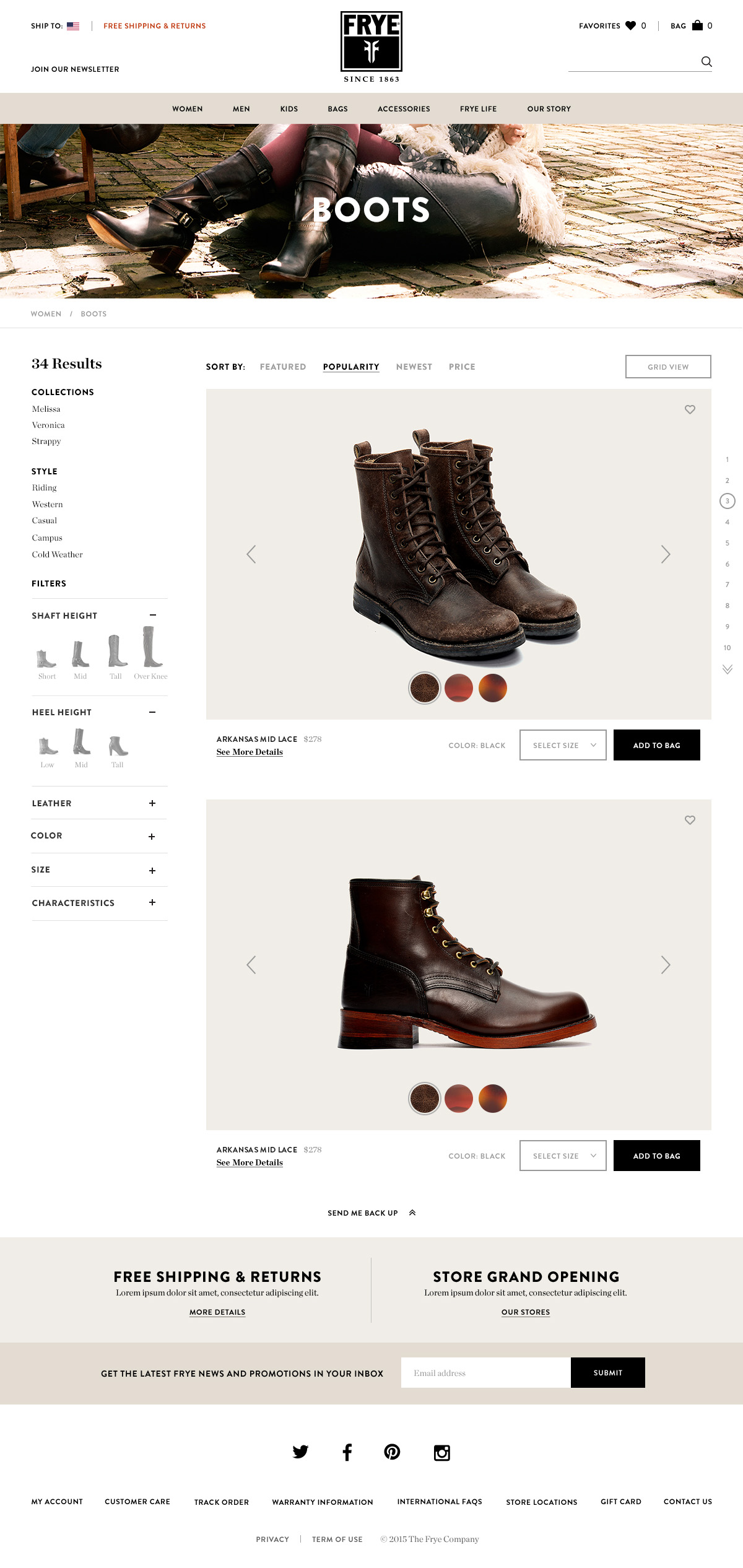
Fyre takes great pride in the quality and craftsmanship of it’s products. How can we exhibit the delicate handwork within the listing page? How can the consumer ‘smell the leather’ right out of the page?
The concept of “Explore View” allows users to view larger, more detailed images of the filtered list of shoes to help them find their perfect pair. Each pair can be easily added to bag without entering the detail page and breaking the experience.
Product Detail Page
Product Detail Page features a right hand sticky selection module, with scrollable detailed images to the left. Description and features of each product are engraved within the images for a more cohesive product story.
This page aimed to answer: Will the shoe fit me? How versatile is it? Is it worth it?
Favorites Page
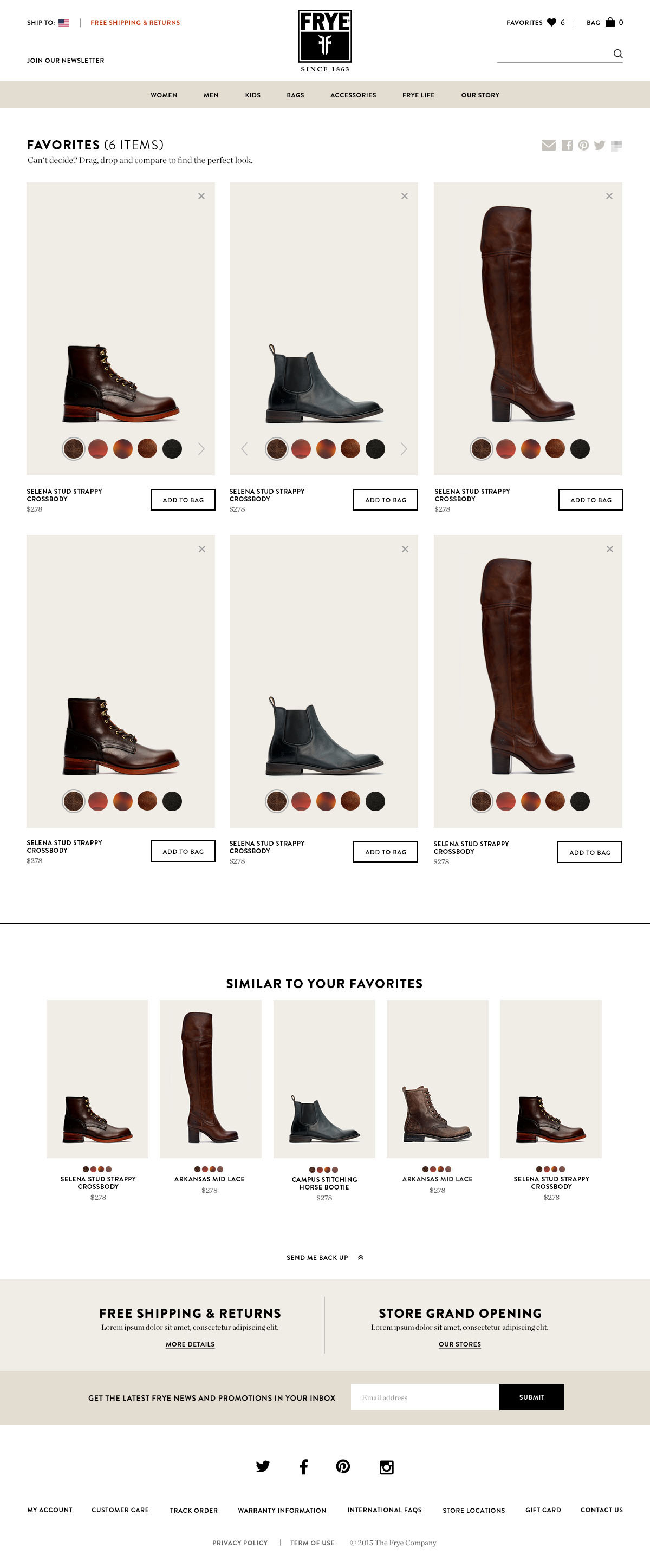
The average consumer from Frye will buy 1-2 pairs of shoes on a single visit to the website. Purchasing a pair of Fryes is a considered an investment for many consumers, and it is likely that they collect various shoes and boots to compare and make a final decision on a purchase.
The Favorites page is designed with large product images with color selections to allow for easy comparison. User has ability drag and rearrange the product list to compare specific products side by side and remove the ones they no longer want. Product information and size/color selection are hidden until user makes a final selection.

